Glossary
- Basic Authentication
A simple method of authentication provided by most HTTP servers where a username and password are supplied. In terms of technical implementation, the HTTP request to the server contains a header field with
Authorization: Basic <credentials>where<credentials>is the base-64 encoding ofusername:password.- Callback Function
A JavaScript function which is passed to Highcharts JS in the
HighchartsOptionsconfiguration which performs an action which affects the chart.Typically, callback functions are used to define event handlers or to define Highcharts formatters.
See also
- Cartesian Charts
Cartesian charts are charts that typically feature two or more axes, by common convention referred to as the X axis (classically represented as the horizontal axis) and the Y axis (classically represented as the vertical axis). If the chart features a third axis (for example in a three dimensional chart), it is commonly called the Z axis.
The location of a data point on a Cartesian chart is the intersection of its metric on one axis (typically the Y axis) and its dimension on the other axis (typically the X axis).
- Cartesian Series
A Cartesian series is a series that can be visualized on a Cartesian chart, which is typically characterized by several different properties including its metric and one or more dimensions, and whose data points get visualized on their intersection.
- Charts
The visualization of numerical, hierarchical, or sequential data in a somewhat graphical representation.
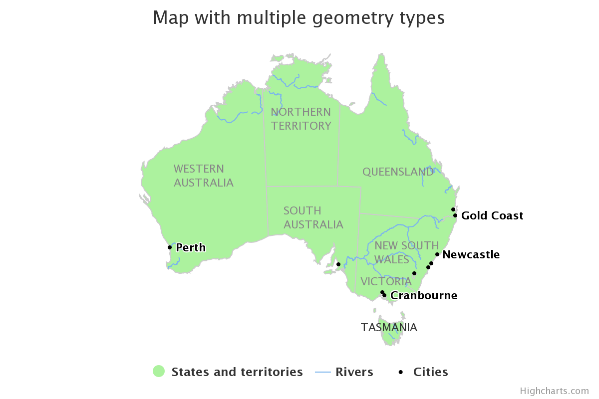
- Choropleth Map
A map where the values of data is represented as the fill color or pattern applied to map areas. Think of it as a classic “heatmap”.
- Color Axis
A color axis is an axis on the visualization that represents a value using its color. Typically, data point metric values are communicated using their position. However, they can also be communicated using the color in which they are rendered. A
Color Axisis used to define the relationship between colors and metric values.See also
- Data Point
A single value that is represented on a chart.
- Data Label
The meta-data associated with a data point that is displayed on the chart. It will typically include labels, the value, and possibly some additional extraneous meta-data and will typically be displayed in a tooltip alongside the data point when user hovers their mouse over the data point.
Represented in Highcharts for Python by
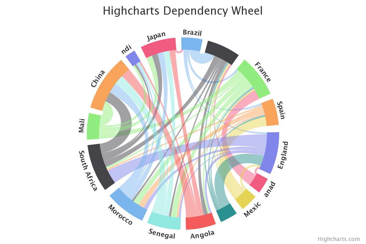
highcharts_maps.utility_classes.data_labels.DataLabeland also affected heavily byhighcharts_maps.options.HighchartsOptions.tooltip().- Dependency Wheel
A dependency wheel chart is a type of flow diagram, where all nodes are laid out in a circle, and the flow between the are drawn as link bands.
- Diamond of Death
A multiple inheritance pattern that is considered an anti-pattern by the Python community because it creates difficult-to-maintain-and-debug complexity. The pattern involves the creation of one ancestor class (we’ll call this class
Ancestor), two child classes (we’ll call themChildAandChildB, respectively), and a third grand-child class that inherits from bothChildAandChildB.This pattern is considered an anti-pattern because - absent a deep understanding of Python’s :iabbr`MRO (Method Resolution Order)` - it is perceived as introducing ambiguity as to which ancestors methods will be executed when hoisting from the grand-child class.
Highcharts for Python - to minimize repetition of code and to keep the code base maintainable - does use this anti-pattern extensively, as discussed in greater detail in the contributors guidance.
- Dimension
A way in which metrics can be organized or grouped. Typically a dimension can be the time period in which a metric was measured, recorded, or reported (e.g. “months” or “days”), or a dimension can be a category that sub-groups your metrics into subjects that you want to analyze (e.g. think “store locations” or “states”).
Tip
In a chart, dimensions are often displayed along the x-axis.
- Drilldown
The act of expanding a data point into a more granular view, typically by changing the properties (or interval) of a dimension.
For example:
if viewing a data point that presents a monthly value, drilling down into that data point may instead show a daily breakdown of the same metric
if viewing a data point that presents information at the level of a given state/province, drilling down into that data point may instead show a breakdown of the same metric grouped by city (within that state/province).
In Highcharts for Python, the drilldown capabilities are configured using the
HighchartsOptions.drilldownsetting.See also
- Event Handler
A JavaScript function that receives information when an event of some sort has occurred and can take action in response to that event.
In Highcharts, this is typically seen as a callback function.
- Export Server
A server application which can receive requests to generate charts, produces those charts headlessly (without a UI), and returns a static export of the charts to the process that requested them.
The Highcharts Export Server is an application written and maintained by Highsoft, creators of Highcharts JS. It is available as a NodeJS application which can be deployed by organizations that license Highcharts.
In addition to the deployable Node Export Server, Highsoft also provides a Highsoft-hosted version of the export server. This Highsoft-provided server imposes rate limiting and other limitations, but can be used by licensees of Highcharts JS to programmatically generate downloadable static versions of their charts.
- Format String
Format strings are templates for labels introduced in Highcharts for Python v.1.2. Since Highcharts (JS) v.11.1, format strings support logic.
We recommend using format strings if you:
Need to save the chart configuration to JSON.
Need to provide a GUI for end users so that callbacks are not practical, or XSS is a concern.
Need to send the charts over to our export server to execute (all callbacks are stripped out).
Are creating a wrapper for another programming language than JavaScript.
See also
For a full overview over templating in format strings, please see the Highcharts (JS) Templating article.
- Formatter
A particular type of callback function used extensively in Highcharts. In general terms, a formatter receives a context (for example a data point) and returns a string that has mutated the data point to apply some formatting.
For example, the data point might be a numerical value (
500) to which the formatter function will append a suffix (`` miles``) for display in the chart’s data label.- Gantt Chart
A type of chart which indicates the start and end of processes along a dimension of time, and may also indicate numerical values associated with that work along the same dimension.
Typically used in projcet management, Gantt Charts are useful for indicating dependencies and critical path for complex multi-faceted workstreams.
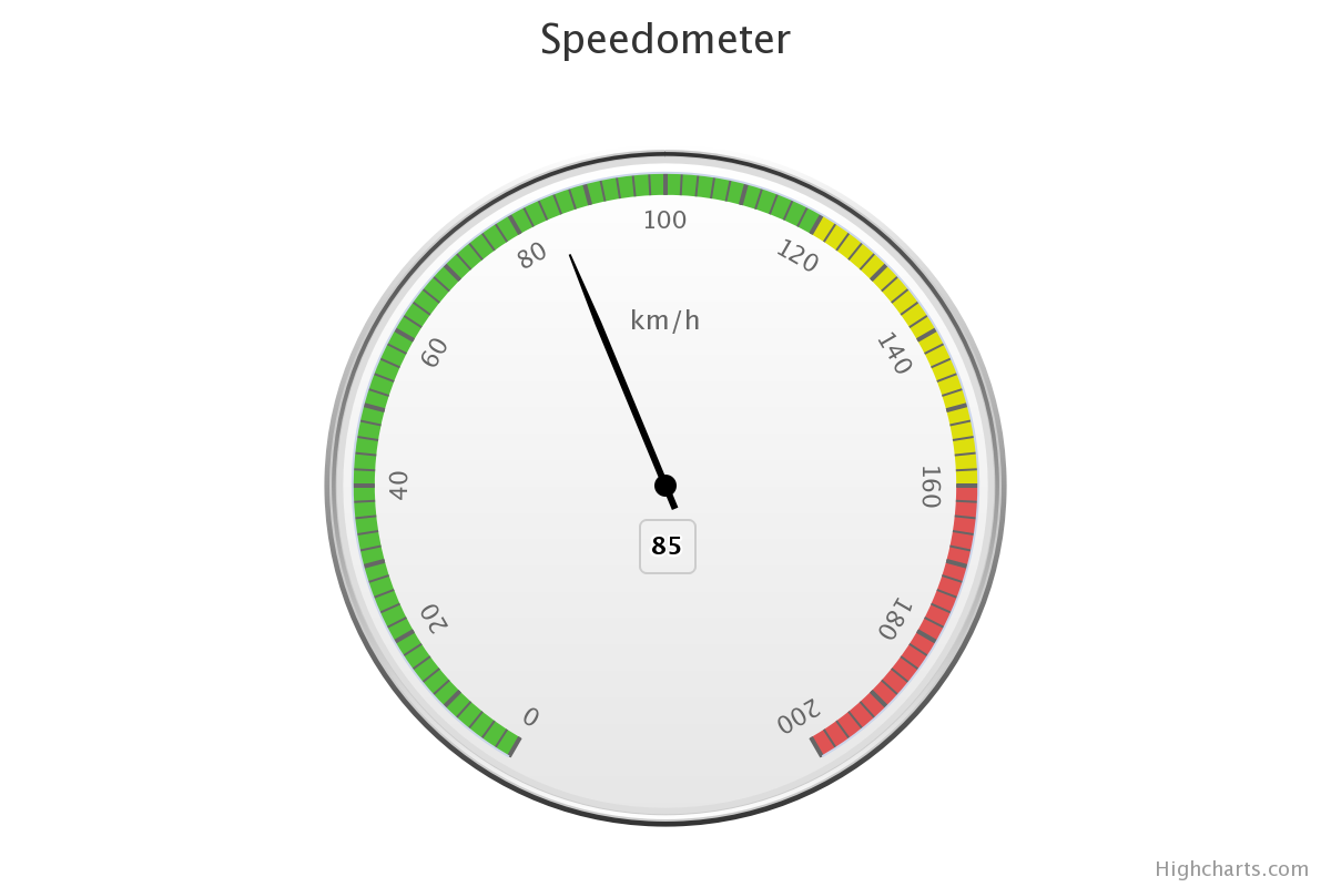
- Gauge Chart
A type of chart which visualizes data as a position on a radial gauge. A classic example is a “spedometer” in a car, which depicts speed using the radial angle around the center point of the gauge.
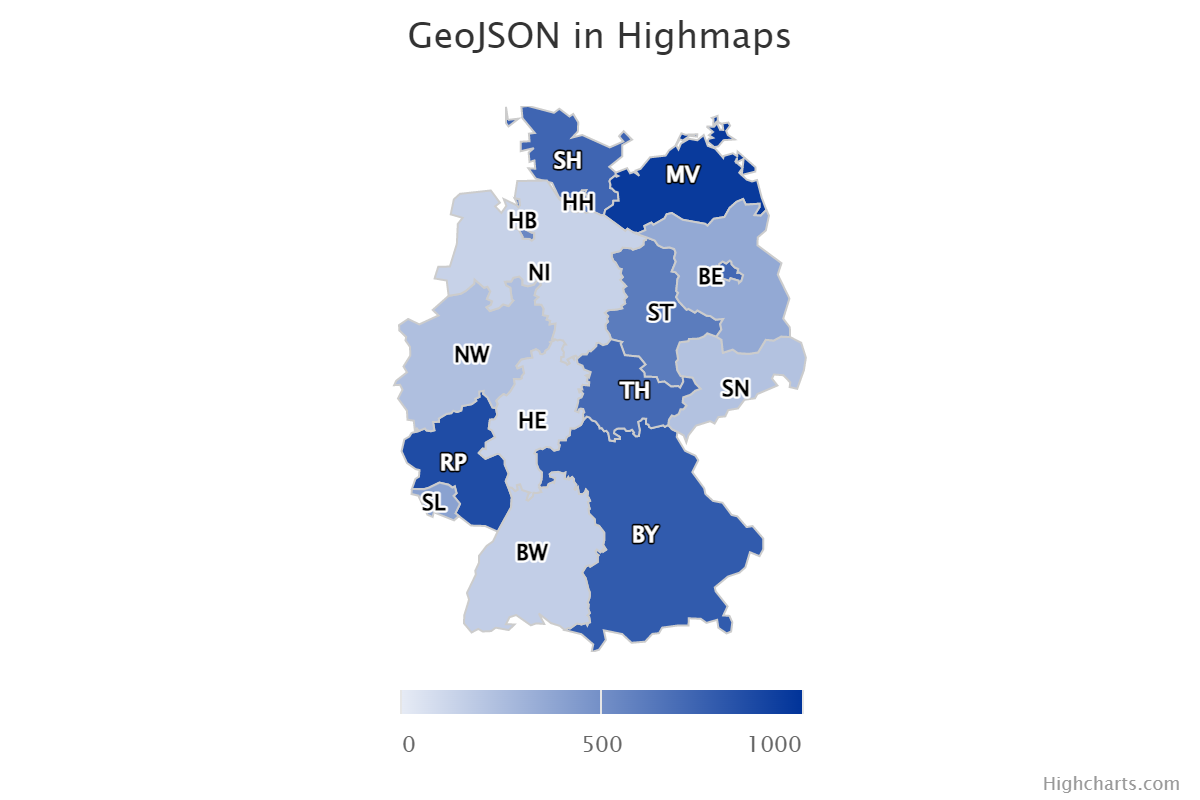
- GeoJSON
GeoJSON is a format for encoding a variety of geographic data structures. It is itself an extension of JSON, and expects each geographic data structure to conform to a standard set of keys (properties).
GeoJSON supports the following types of geometry:
PointLineStringPolygonMultiPointMultiLineStringMultiPolygon
Geometric objects with additional properties are
Featureobjects. Sets of features are contained inFeatureCollectionobjects.Formally, GeoJSON is defined in RFC 7496.
- JavaScript Object Literal Notation
A way of representing data in JavaScript as native JavaScript objects which is necessary to maximize value from Highcharts JS.
It is easiest to compare JavaScript object literal notation to the closely-related JSON (JavaScript Object Notation), though they are very different and serve very different purposes.
JavaScript Object Literal Notation is JavaScript source code. JSON is not. JSON is a way of encoding data into a text form that JavaScript is able to parse and deserialize. Because Highcharts JS relies heavily on JavaScriot object literal notation to support the definition of event handlers and callback functions, Highcharts for Python is designed to serialize and deserialize Python representations to/from their JavaScript object literal form.
Below is a comparison of a (similar) object represented in both JavaScript object literal notation and JSON, with further commentary:
JavaScriot Object Literal Notation
JSON
{
  myProperty: 'this is a property',
  anotherProperty: 123,
  aBooleanProperty: true,
  myCallback: function() { return true }
}
- {
“myProperty”: “this is a property”, “anotherProperty”: 123, “aBooleanProperty”: true
}
As you can see, the two forms are very similar. However, the JavaScript object literal notation has its keys directly accessible as properties of the object, while the JSON version has them represented as strings. Furthermore, because JSON is inherently a way of encoding data into strings, it is not wise to use it to transport functions which will then be executed by some other code (doing so is a dangerous security hole).
Caution
Typically, JSON can be converted to JavaScript object literal notation easily…but the opposite does not hold true.
- Map
Map charts are simple choropleth visualizations where each area of the map is given a color based on its value.
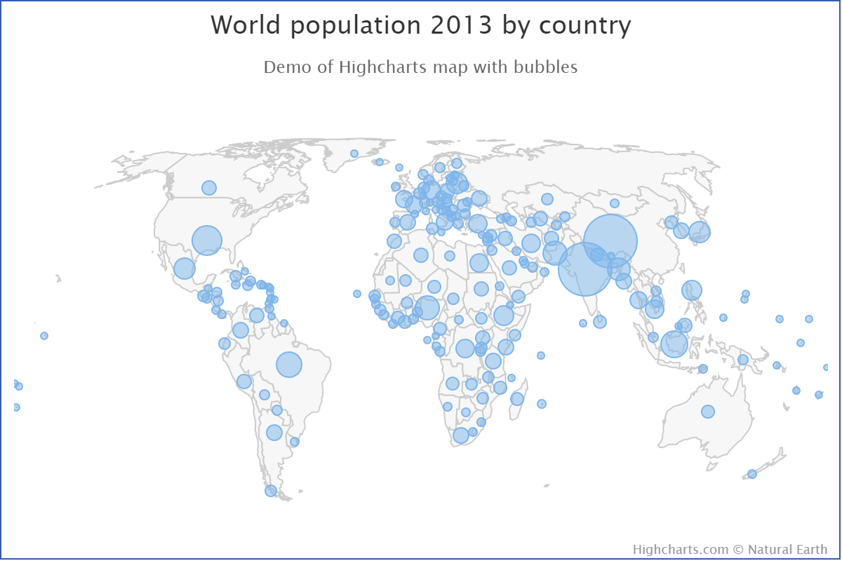
- Map Bubble
Map Bubble charts are maps where the numerical value is depicted as a bubble rendered over the corresponding area of the map rather than as a color.
See also
highcharts_maps.options.options.plot_options.mapbubble.MapBubbleOptions
- Map Geometry
A map geometry, or more commonly simply a geometry, is the definition of a geographic area or feature. It can be composed of points, lines, and polygons and may be accompanied by additional meta-data regarding the geographic area or location.
Typically, map geometries correspond to the areas drawn on a map. The border of a given country is an example of a map geometry (likely a collection of lines). The seat of government in that country can also be a geometry (in this case, likely a point).
Map geometries - and the components that comprise a map geometry - are defined in terms of a spatial reference or coordinate system. Latitude and longitude is probably the best-known spatial reference system, but this ensures that all geometric components of a map geometry can be rendered together in a way that most-closely reflects reality because they are using a shared projection system.
In GIS, map geometries are typically stored in ESRI shapefiles, GeoJSON, or TopoJSON.
- Map Inset
A map inset is a secondary map represented alongside a primary map. It is typically used to depict either non-contiguous areas (e.g. you might have a map of the United States, with the states of Alaska and Hawaii represented as insets on the map) or to depict a more detailed representation of a particular area (e.g. you might have a primary map showing data at a country level, but then you may have an inset that zooms in on a particular province or city with different data depicted).
- Map Line
Map Lines are a special version of a map series where the value affects the the strokes (borders) shown on the map, rather than the area fills.

Tip
Best practice!
This can be useful for applying free-form drawing within a map, or for rendering geometric features like rivers or mountains in your map.
- Map Point
Map Points are a special version of a scatter series where the points are positioned according to geographic coordinates within a map.
Tip
Best practice!
This can be very useful for rendering cities or other locations on your map.
- Metaclass
A Python class that is used to define properties and methods - including abstract properties or methods which are not implemented in the metaclass itself - which are then inherited by sub-classes that derive from the metaclass.
Metaclasses are typically used as good DRY programming and to ensure a consistent interface (standard methods) across multiple classes in your code.
In the Highcharts for Python Toolkit, metaclasses are defined in the
.metaclassesmodule, and most inherit from the.metaclasses.HighchartsMetaclass.See also
- Metric
The value of a measurement. Think of it as a “type” of number. A metric might be “number of miles”, or “dollars spent”, or “temperature”. It is a value that can be measured and recorded, and which is typically visualized in charts.
Tip
In a chart, metrics are often displayed along the y-axis.
- Metric Suffix
A symbol that is used to shorten numerical values that would otherwise have a lot of (typically repetitive) numbers. For example, if
10,000were represented as10k, thekwould be considered the metric suffix.See also
- Network Graph
A network graph is a type of relationship chart, where connnections (links) attract nodes (points) and other nodes repulse each other.
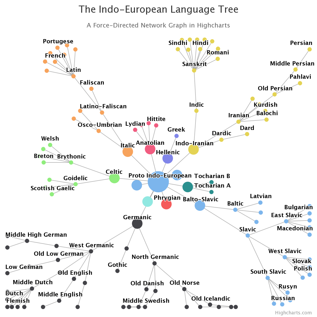
See also
- Oscillator
Caution
Oscillators are only available in Highcharts Stock for Python.
oscillator is a type of technical indicator that is used to analyze bands
d trend evolutions. Oscillators typically are visualized by adding high and low nds around the series being analyzed and then adding a trendline calculation at fluctuates between these bands.
seealso:
Supported Visualizations > Technical Indicators
Using Highcharts Stock for Python > Using Technical Indicators
- Plot Band
A banded area displayed on a chart bounded by two points on an axis. Typically used to either help highlight a particular range of values or to visually differentiate groupings of metrics along a dimension.
Tip
A common use case is to specifically highlight a section of the chart in a range of interest along a particular axis.
- Plot Line
A line drawn in the chart’s plot area spanning the plot area in a position relative to the axis. Typically used to demarcate a cut-off point or transition point along a range of values.
- Polar Chart
A Polar chart is a radial chart that uses values and angles to show information as polar coordinates. While technically they are Cartesian charts (the X-axis is typically wrapped around their perimeter), they are usually treated and considered their own category of data visualization.
- Projection
All maps are projections of a three-dimensional object (a globe) onto a two-dimensional plane (a map). Any such projection will in some ways distort the proportions of the areas depicted, and you may want to apply a different projection to better communicate insights from your data. Projections are applied and manipulated by recalculating coordinates in one coordinate reference system to a different coordinate reference system.
The projection that is used when depicting a Highcharts Maps for Python visualization are configured using the
MapViewOptions.projectionproperty, which takes aProjectionOptionsinstance.Highcharts for Maps supports both a number of built-in projections as well as providing the ability to apply a fully custom projection. The default projections supported are:
'EqualEarth''LambertConformalConic''Miller''Orthographic''WebMercator'
which can be compared using Highcharts Projection Explorer demo
If you wish to define a custom projection (which is calculated client-side in your JavaScript code), you can do so by supplying a
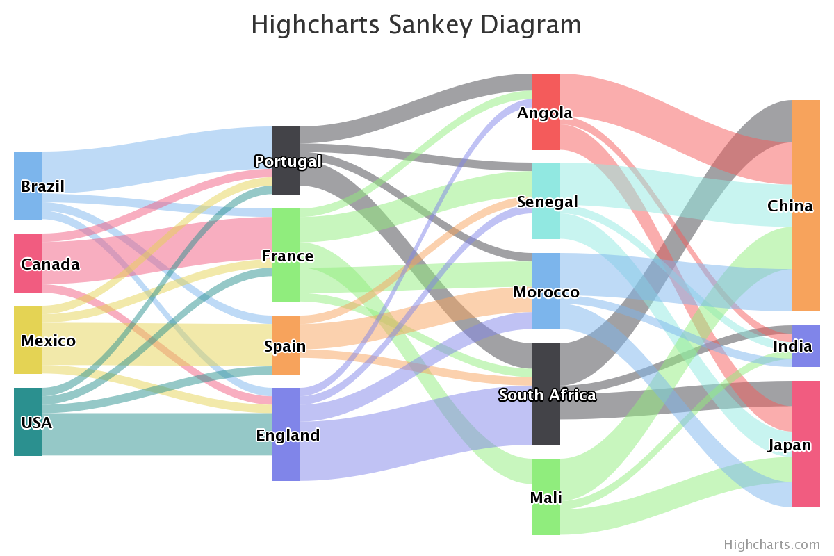
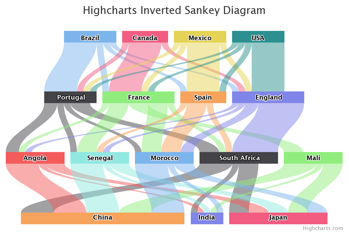
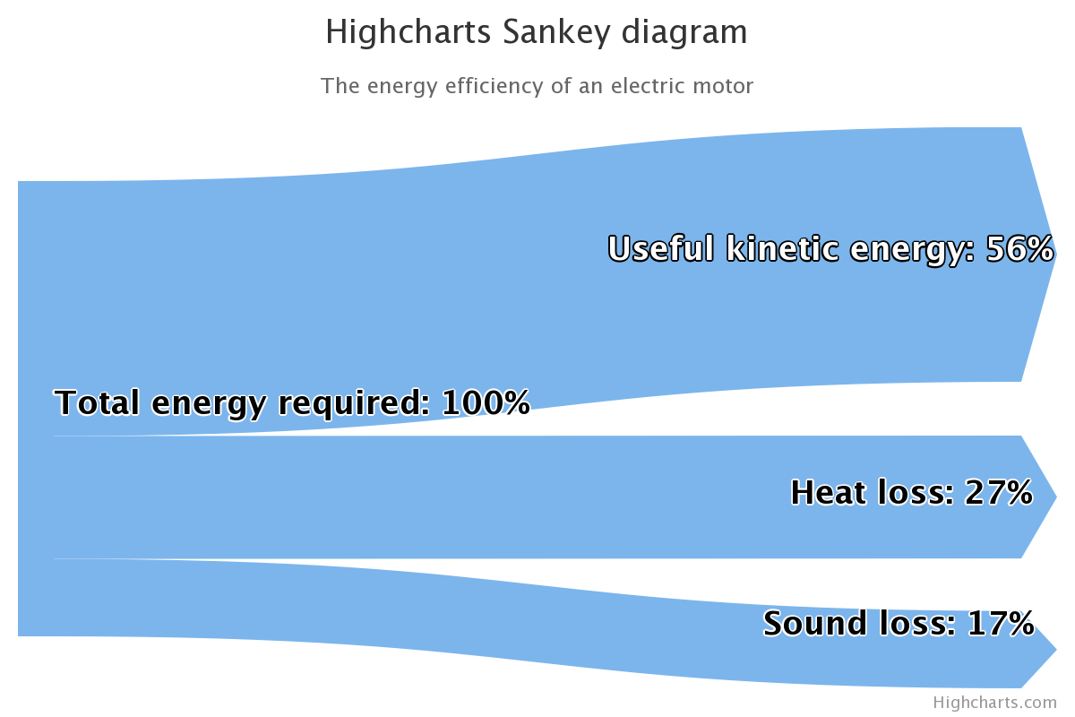
CustomProjectioninstance toMapViewOptions.custom.- Sankey Chart
A sankey diagram is a type of flow diagram, in which the width of the link between two nodes is shown proportionally to the flow quantity.
See also
- Series
A collection of data points that are expressed using a shared metric, along a shared dimension, or sharing a common property (e.g. a meta-data category that describes the scope of the data points).
Tip
Think of a “series” as one line on a line chart.
- Shapefile
Shapefiles are a way of encoding map geometries developed by ESRI. They are a proprietary format, but with an openly-published standard definition.
See also
Shared Options are global configurations that are applied to all Highcharts visualizations that are displayed at the same time (on one web page, typically). They are typically used to practice good DRY programming and to minimize the amount of code rendered in the page itself.
In the Highcharts for Python Toolkit, shared options are managed through the
SharedOptionsandSharedStockOptionsclasses.See also
global_options.shared_options<highcharts_maps.global_options.shared_options>SharedStockOptions
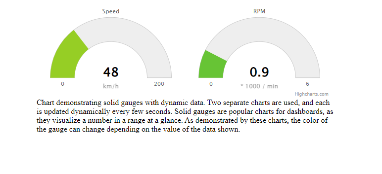
- SolidGauge
A solid gauge is a circular gauge where the value is indicated by a filled arc, and the color of the arc may variate with the value.
See also
- Stem
In a
BoxPlotSeriesor similar, the vertical line extending from the box to the whiskers.See also
- Styled Mode
Styled mode is a method of adjusting the look and feel of your Highcharts charts using CSS styles as opposed to the explicit configuration in
HighchartsOptions.When it is enabled, styling configuration in your options will be ignored in favor of CSS styling. To enable it, set
HighchartsOptions.chart.styled_modetoTrue.Caution
Highcharts for Python does not currently support the configuration of CSS styles when operating in styled mode. It is, however, an item on our roadmap (#8).
See also
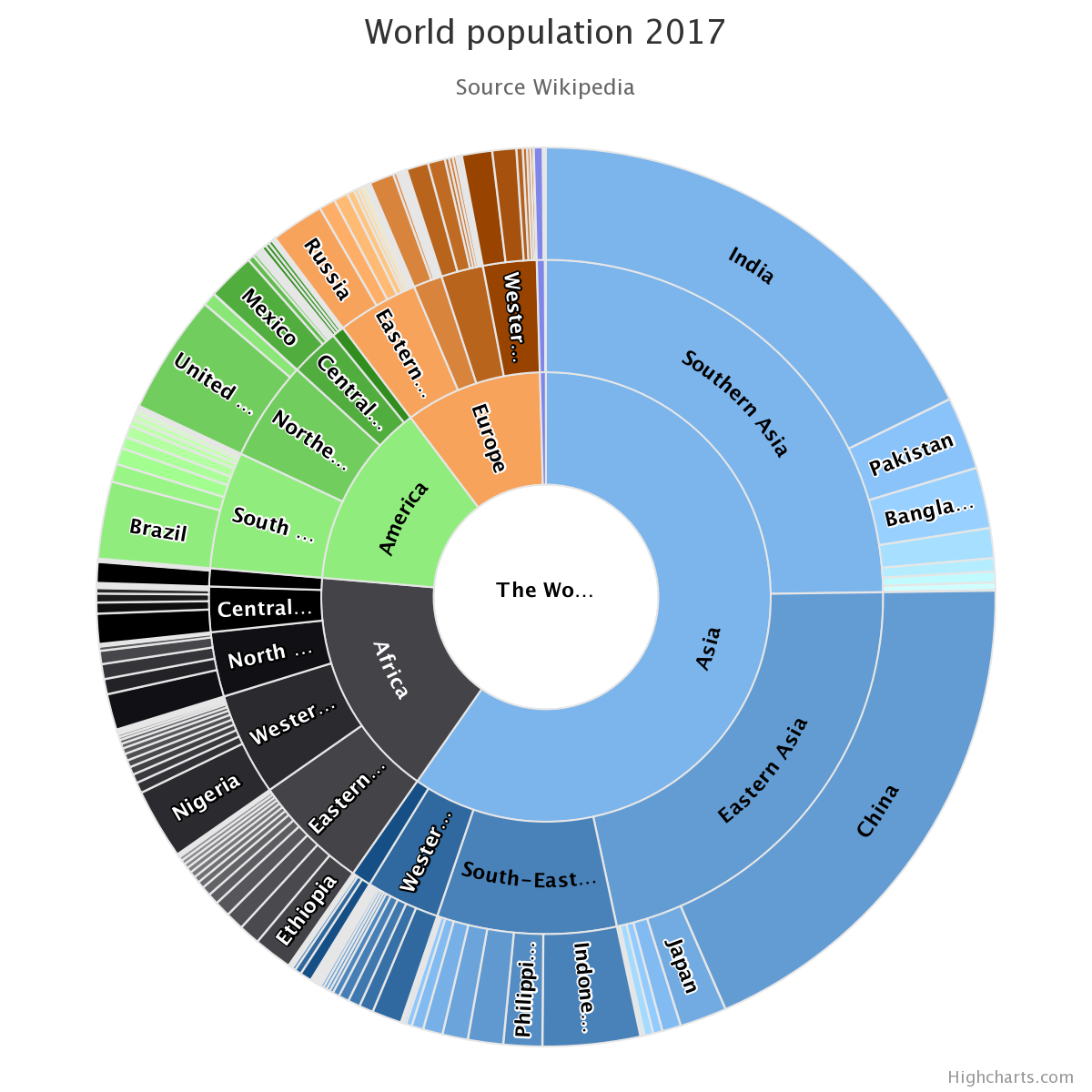
- Sunburst
A Sunburst displays hierarchical data, where a level in the hierarchy is represented by a circle. The center represents the root node of the tree. The visualization bears a resemblance to both treemap and pie charts.
See also
- Technical Indicator
Caution
Technical indicators are only available in Highcharts Stock for Python.
chnical indicators are analyses performed on another series that can provide ditional insights. For example, by looking at a linear regression of a time series u can gain insight into the overarching trend of the data.
Highcharts Stock for Python** supports over 50 different technical indicators. dicators differ from typical series in that they do not accept data of their n. They do not have a
.dataproperty, and do not receive their own data points. stead, they are automatically calculated by ighcharts Stock <https://www.highcharts.com/products/stock/>`__ by linking the dicator series to a main series on the chart itself.seealso:
Supported Visualizations > Technical Indicators
Using Highcharts Stock for Python > Using Technical Indicators
SeriesBase.add_indicator()SeriesBase.get_indicator()Chart.add_indicator()
- TopoJSON
TopoJSON is an extension to the GeoJSON standard which encodes topologies rather than geometries.
By stitching together line segments into discrete arcs, TopoJSON eliminates redundant data that would otherwise be present in a GeoJSON representation of a given map geometry.
A good example of how TopoJSON achieves this is to consider the border between two countries. If represented as a map geometry, the border where Country A touches Country B will be represented twice: once in the geometry that defines Country A, and once in the geometry that defines Country B. In TopoJSON, that portion of the border where Country A and Country B touch will be represented once, eliminating redundant data.
Map geometries can be converted to TopoJSON, leading to a significant reduction in the size of the geographic data.
Note
Highcharts Maps for Python treats map geometries as TopoJSON by default, converting to the format as necessary.
- Topology
An optimized set of information which can be used to define and render a collection of map areas or features. While it achieves the same goal as a map geometry, it is a representation of coordinate-based data that is far more efficient thanks to the elimination of redundant data.
A good example of how topologies achieve this can be envisioned when considering two countries: Country A and Country B. Let’s imagine a scenario where Country A and Country B are neighbors, and they share a border.
If represented as a map geometry, the border where Country A touches Country B will be represented twice: once in the geometry that defines Country A, and once in the geometry that defines Country B. When represented as a topology, that section of border shared between Country A and Country B will only be represented once and will be shared by both countries.
See also
highcharts_maps.utility_classes.topojson>highcharts_maps.utility_classes.geojson>
- Untrimmed
Note
This is a term that relates to Highcharts for Python’s internal operations. If you are not Contributing to Highcharts for Python to the library, you don’t need to worry about it.
An untrimmed
dictrepresentation of a Highcharts for Python object includes those properties that haveNonevalues. In order to minimize data on the wire and maintain consistency with Highcharts JS, properties that have values ofNonewill be removed when serializing objects to JavaScript object literal notation or to JSON. The untrimmed object is the representation of the object before those properties are removed, where values ofNoneare still explicitly present.See also
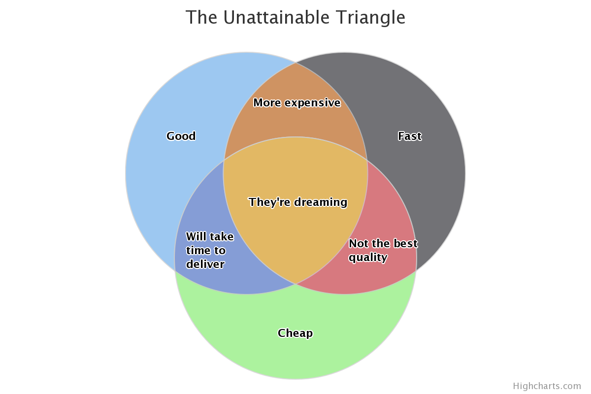
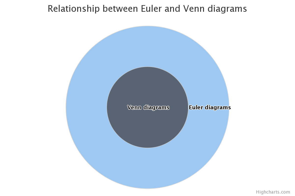
- Venn Diagram
A Venn diagram displays all possible logical relations between a collection of different sets. The sets are represented by circles, and the relation between the sets are displayed by the overlap or lack of overlap between them. The venn diagram is a special case of Euler diagrams, which can also be displayed by this series type.
See also
- Whisker
In a
BoxPlotSeriesor similar, the horizontal lines marking low and high valuesSee also
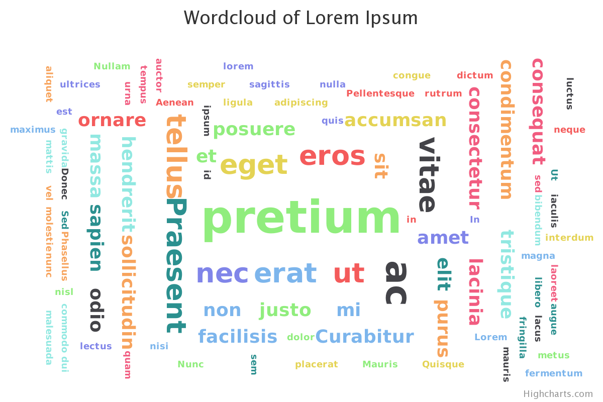
- Wordcloud
A word cloud is a visualization of a set of words, where the size and placement of a word is determined by how it is weighted.
See also
fin